Year
2023
Client
Jodie Conrad
Category
Branding & Packaging
Product Duration
3 - 4 Weeks
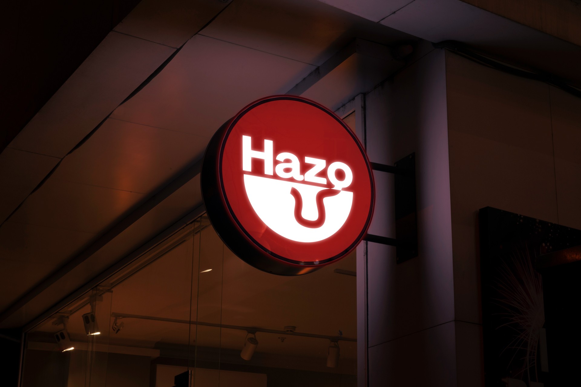
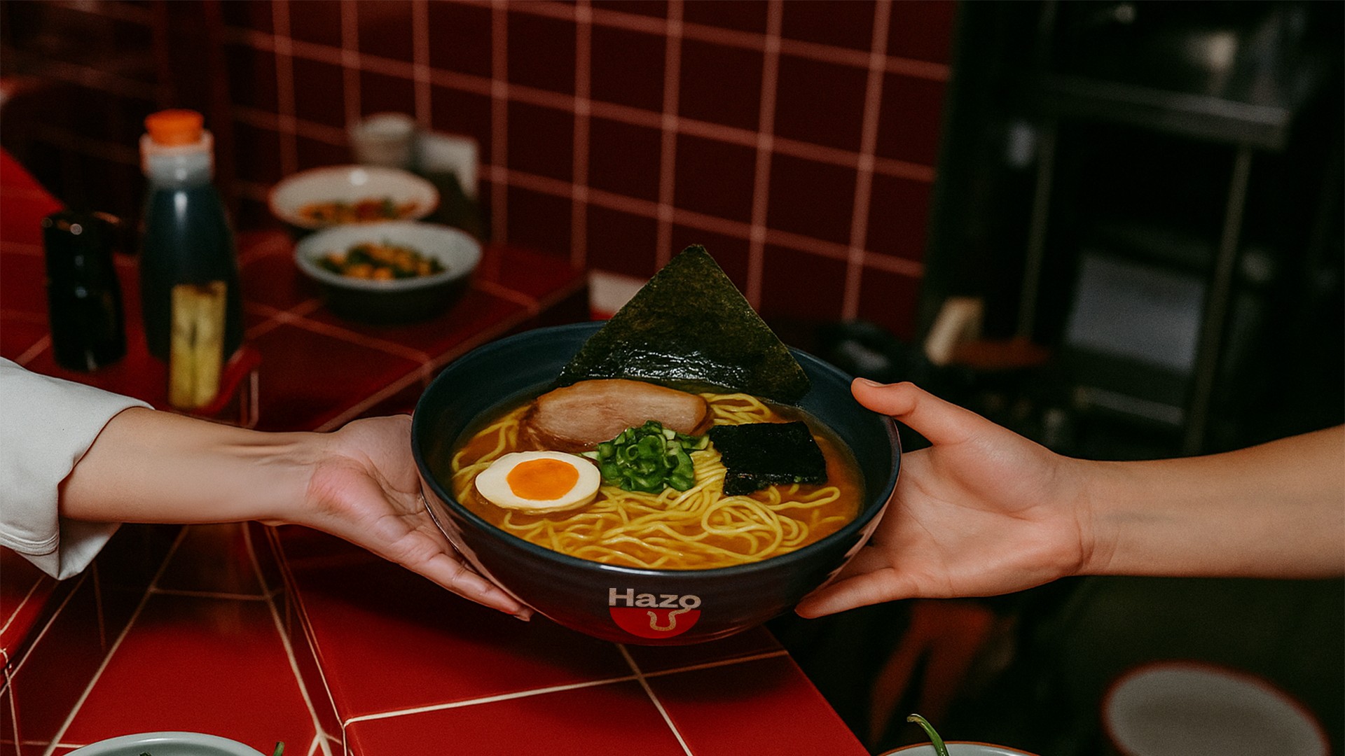
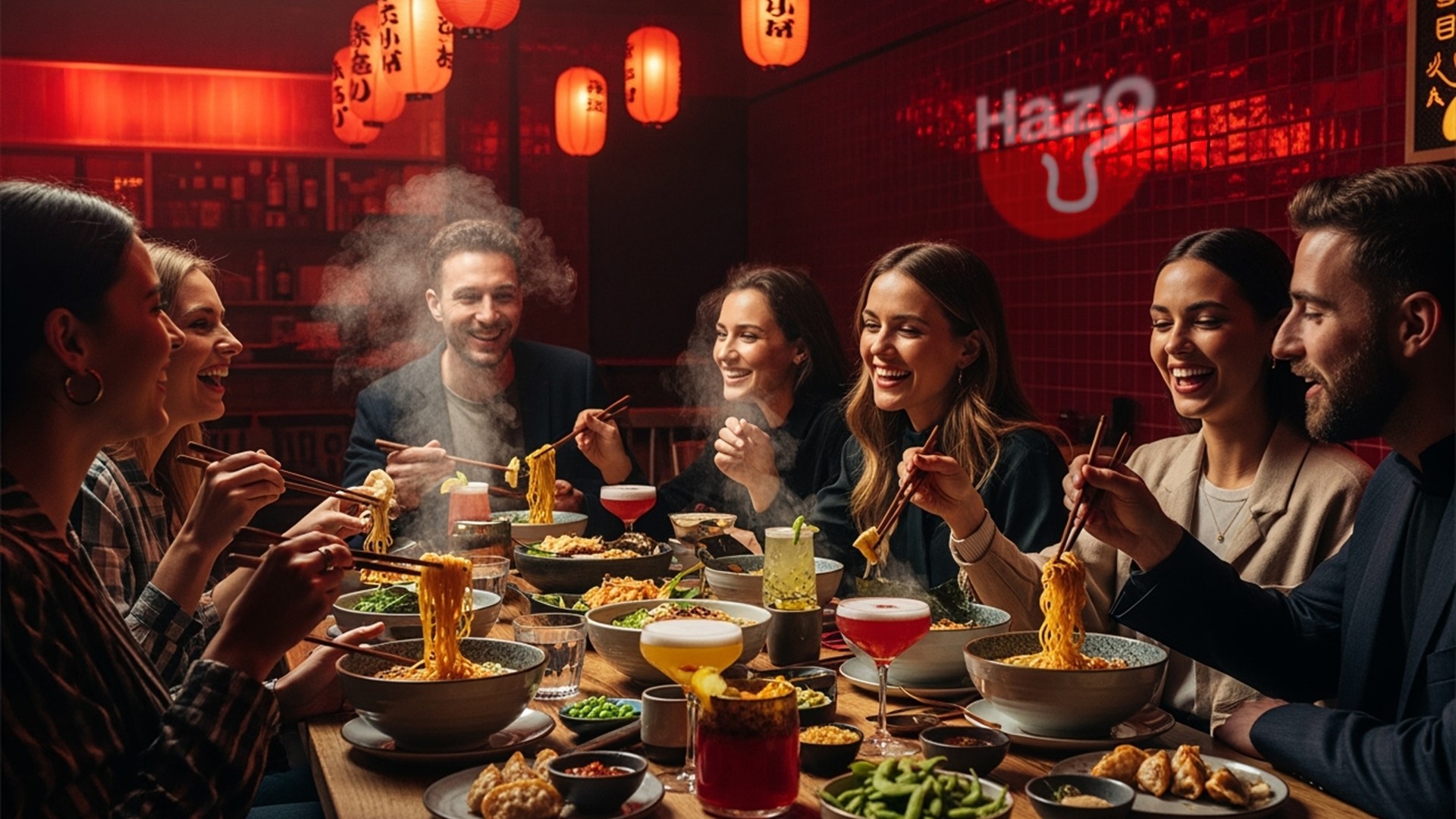
Hazo is more than just a ramen bar. It's a gathering place for people who live the city intensely: young creatives, stylish outsiders, night owls who crave authenticity. The branding blends urban grit with Japanese minimalism, creating a strong visual identity without losing the warmth that defines the ramen experience.
From the logo to the atmosphere, everything is designed so the customer feels like they’ve stumbled upon a hidden gem — a modern, alternative space with personality, where eating ramen feels like a ritual.
The main goal was to design a brand identity that broke away from the usual ramen visual clichés while keeping the emotional essence of the dish. We needed to speak directly to a generation that connects with edgy design, cultural mashups, and bold character. From naming to logo, the challenge was to craft something that could live both in a neon-lit alley and on a carefully curated Instagram feed. The entire system had to feel authentic, fresh, and slightly offbeat — in a good way.

The result is a brand that doesn’t shout but still gets noticed. The logo —a minimalist bowl with a flowing line evoking a single ramen noodle— captures the product’s essence in a clean, powerful way. A bold color palette of deep reds and crisp whites injects warmth and energy, while a modular graphic system keeps things adaptable across menus, packaging, signage, and merch. The final brand feels both sensory and visual: a place where good design and good ramen meet with personality.
Hazo aims to reimagine the ramen experience for a new generation by blending culinary authenticity with bold design, art, and alternative culture. Our vision is to become a global reference for contemporary ramen — where every location feels like a hidden gem and every bowl tells a story worth sharing.