Year
2023
Client
Akari Inaba
Category
Branding
Product Duration
4 - 5 Weeks
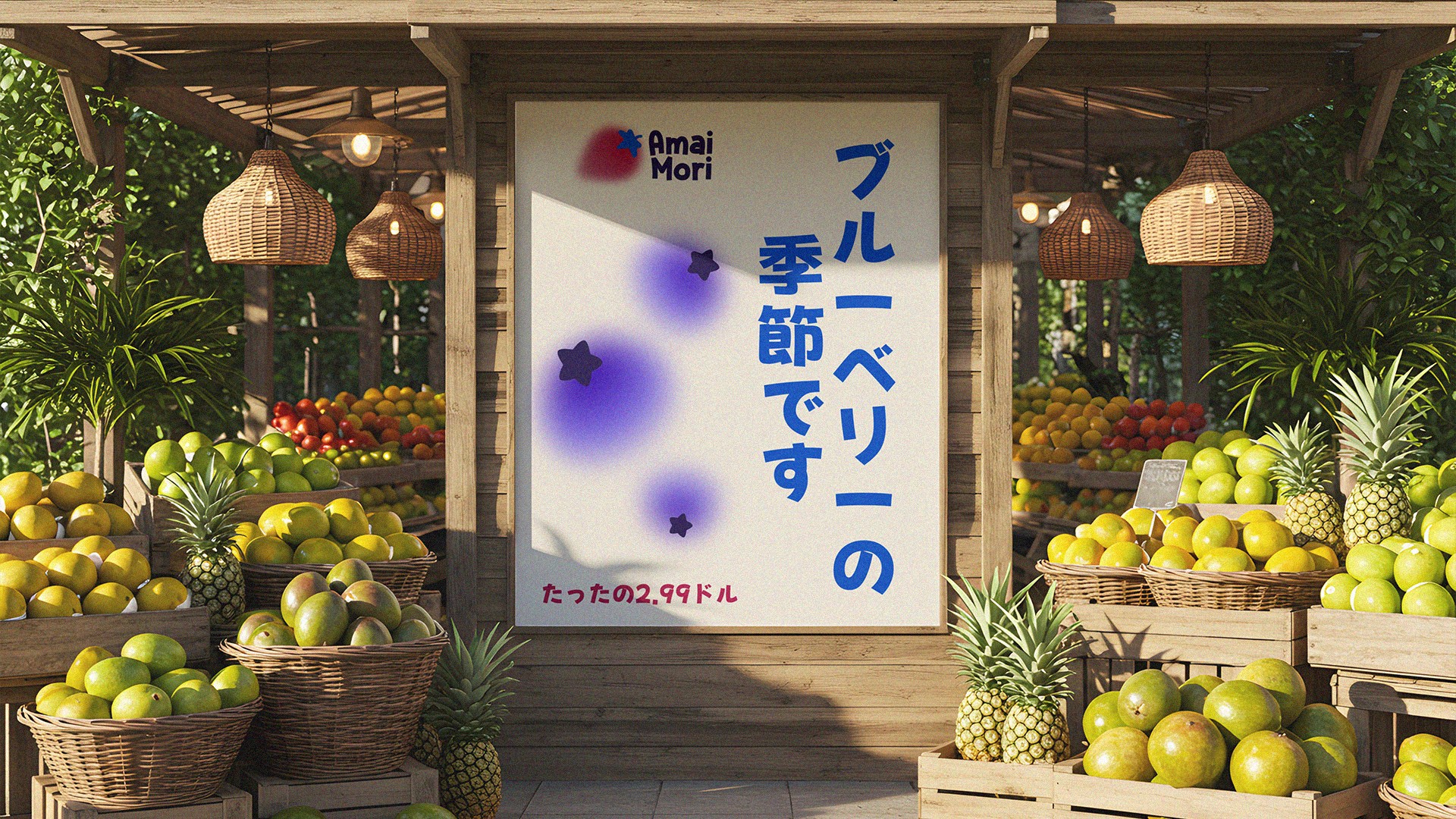
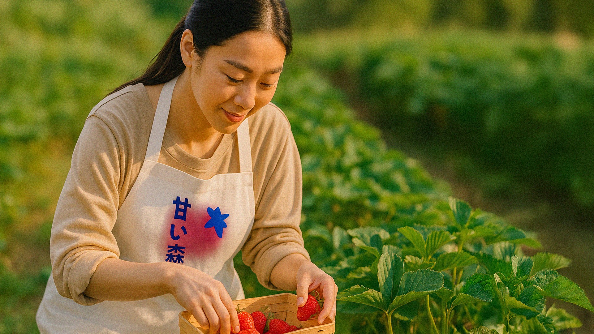
Amai Mori (甘い森), meaning “Sweet Forest,” was born from the idea of turning a simple fruit shop into a whimsical, visual experience. The concept blends the freshness of nature with soft, playful design cues inspired by modern Japanese culture — from the color palette to the typography and illustrated elements. The brand is built to feel joyful and gentle, evoking the feeling of walking through a sun-drenched orchard where every fruit tells a story. More than just a place to buy produce, Amai Mori invites people into a small, sweet world — one that feels both nostalgic and new.
The goal was to create the full brand identity for Amai Mori (甘い森), a Japanese-inspired fruit shop. The brand needed to feel aesthetic, fresh, and friendly, combining cultural nods to Japan with a clean, modern visual style.
The project included developing the primary logo, graphic variations, color palette, and branded applications for social media, packaging, and signage.
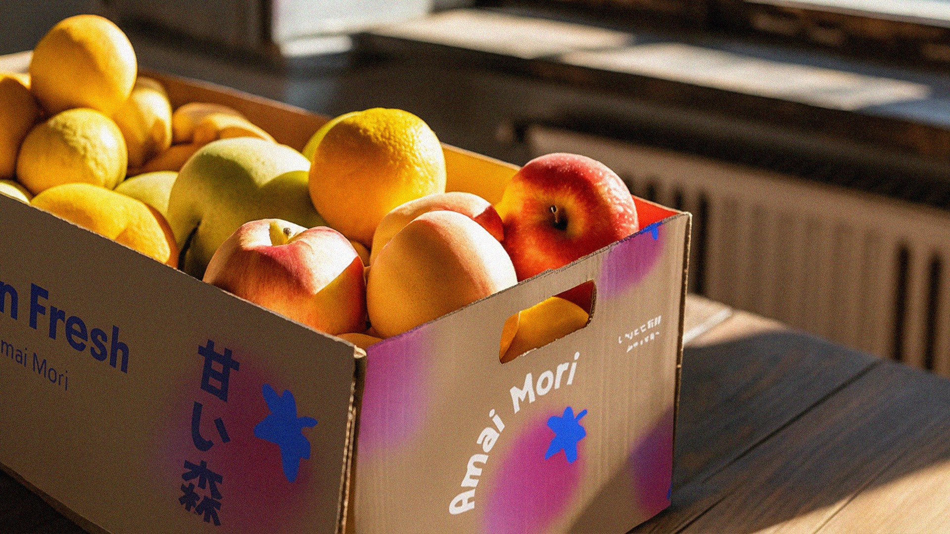
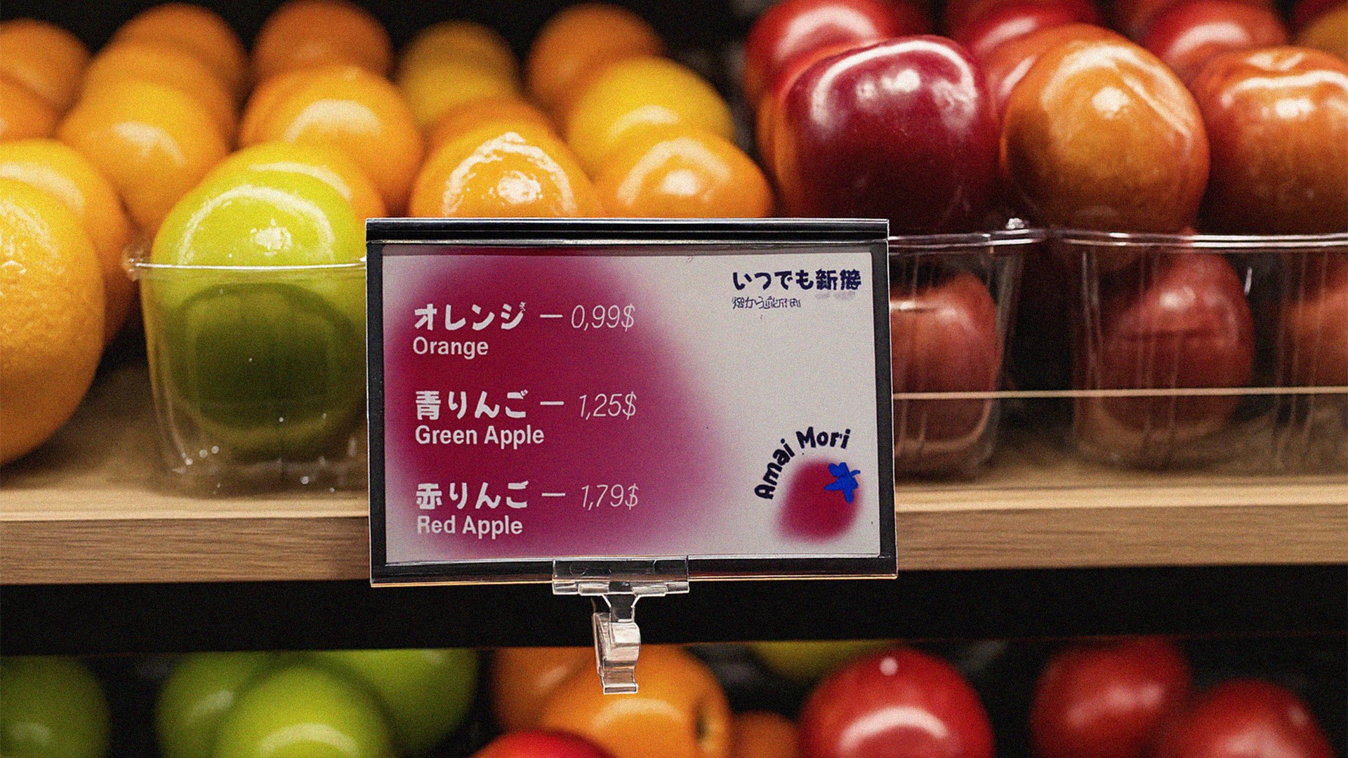
The final identity features a versatile logo with rounded typography and a vibrant fruit-inspired symbol, evoking the brand’s sweetness and playfulness.
The color palette (vivid pinks, electric blues, and deep accent tones) creates a bold yet welcoming aesthetic, helping Amai Mori stand out from traditional fruit stores.
The visual system seamlessly adapts to packaging, labels, store signage, and digital materials, ensuring a cohesive and memorable brand presence.
At Amai Mori (甘い森), our mission is to sweeten people’s lives with fresh, high-quality fruits while celebrating Japanese aesthetics and modern design. We strive to become an iconic fruit shop that goes beyond selling produce, creating a visual and sensory experience that brings the charm of Japan to every customer.